Digital
Video
Video is an important medium for connecting
with our members. Videos may be instructional,
guiding members through a process. They may
be illuminating and emotional, sharing a member
or employee’s journey. Or they may be fun,
offering a behind-the-scenes look at CareOregon
and our place in the community.
Whatever their purpose, our videos follow certain
guidelines. We’ve outlined them below.
Opening slide
The official opening slide includes the line-ofbusiness logo and the title of the presentation. This creates a consistent experience for the viewer and builds equity in the CareOregon brand.
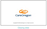
Closing slide
The official closing slide includes the line-ofbusiness logo and copyright information. This creates a consistent experience for the viewer and builds equity in the CareOregon brand.
Lower thirds
Use the lower third of a slide to identify the subject or person speaking. Include first and last name, title, and department or company. If the subject has multiple titles, use the title most directly related to the content of the story. Use this format the first time the person appears and speaks.
Bug
When appropriate, a small solid white version of the CareOregon logo (“bug”) should appear in all video openings. Keep the bug in the lower right

See our library of videos
Find our public-facing videos at youtube.com.
Audio guidelines
Keep audio peaks between -2 and -8db if possible, with no peaks at 0db throughout the sequence. If music is used along with spoken words, make sure the speaker’s audio remains clear and easily heard. Avoid copyright music, always. If you buy stock music, use it in compliance with the licensing regulations.
Color and framing
Use images that are in focus and exposed with the proper white balance. Frame subjects in a way that provides suitable headroom and follows the rule of thirds for framing. See: bhphotovideo.com/explora/photography/ tips-and-solutions/framing-rule-thirds Keep images stabilized. Avoid using shaky shots if possible.
Web
Our websites and apps must be effective tools to reach a variety of audiences. We follow all CareOregon brand styles for fonts, logos, images and copy as described in this guide, with some additional web-related requirements:
- Web applications must be designed with a user experience that transitions fluidly between desktop and mobile devices of all screen sizes.
- Web applications must meet ADA 508 compliant standards for accessibility, readability and navigation, specifically regarding member materials. See ada.gov/508
- Web applications must follow current, accepted practices of layout and navigation for ease of user experience.
Writing and designing for digital
Capitalization and punctuation rules generally
follow our print style, unless there are practical
reasons not to.
Set off URLs in some way such as color, boldface
or italic. PDFs that have clickable links, and online
URLs, have some different considerations from
printed-only URLs.
URLs (uniform resource locators) are
all lowercase.
If a URL is included in the flow of a sentence,
use a preposition (such as “at”) to set up the
address, not a colon. Do not use a colon and
a preposition.
Do not use a leading www or http with web
addresses, but make sure the address works
without them.
When a URL is at the end of a single-sentence
item, paragraph or block of text, do not use a
period to end the sentence.
We typically do not underline for emphasis.
We use italic, boldface, color and capitalization,
but sparingly.
Social Media
CareOregon’s Core Values informs our social media presence: Genuine, Brave, Optimistic, Thoughtful, Steadfast and Caring. In all instances, our voice projects care and thoughtfulness.
The narrative we construct for our followers in our various feeds reflects our Steadfast nature in the ever-shifting health care community.
We showcase our Brave commitment to health care for all through the sharing of partner content and by highlighting our work in the community.
We’re Optimistic about health outcomes as we share a consistent stream of resources and information to empower people facing specific health challenges.
Platforms
Each social media platform has its own purpose and set of best practices, and we follow these to achieve greater connectivity through these networks. While we often broadcast outbound messaging, we’re also committed to on-going dialogue with our network followers through commenting, sharing and direct messaging. We direct inbound messages appropriately.
In all messaging exchanges, we strive to make a genuine connection and provide caring, consistent service. Above all else, we recognize social media platforms as points of direct connections for our various audiences. We aim to honor the value of that connection and use each platform to its strengths to provide ongoing value to our followers.
Back to table of contents
Careoregon brand style guide