Visuals
Logo Treatment
Primary logo
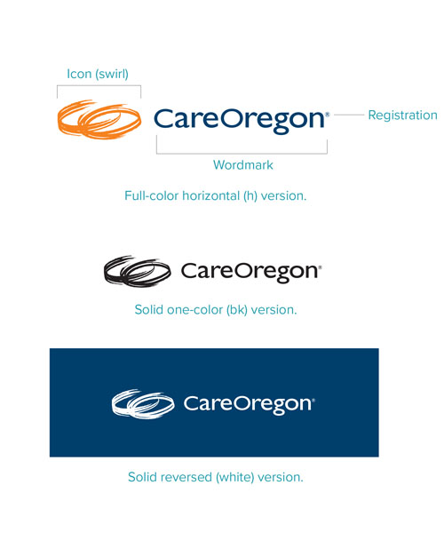
- Our CareOregon logo consists of three elements: the icon, the wordmark and the registration.
- The three elements should never be used separately. The only exception is the screened icon (swirl) used as a background pattern and in other places too.
- Use the vertical (v) version of the logo whenever the space allows.
- If printing in one color, do not screen the logo.

Logo Treatment
Secondary logo
- Use the horizontal (h) logo when space does not allow the use of the vertical (v) logo.
Logo Treatment
Minimum sizeand safe area
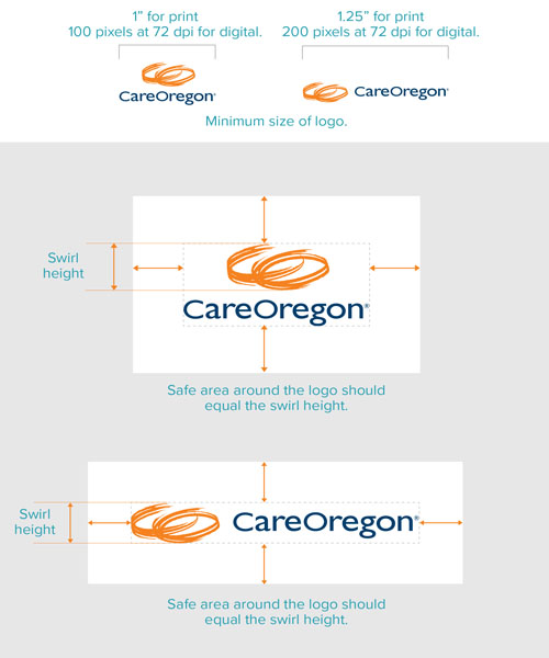
To make sure our logo is clearly visible, we have minimum sizes for print and digital.
- When printing, logos reduced to less than 1” for the primary vertical (v) logo and 1.25” for the horizontal (h) logo are too small to be clearly visible.
- For 72 dpi digital applications, keep the vertical logo above 100 pixels, and horizontal more than 200 pixels.
- There may be an occasional exception to the minimum size, such as printing on small swag items.
- The safe area prevents other nearby elements from distorting the perception of the logo.
- When defining the safe area, measure the height of the swirl (logo icon). This vertical measure needs to be the size of the clear area around the top, bottom and sides of the logo.
Logo Treatment
Logo colors
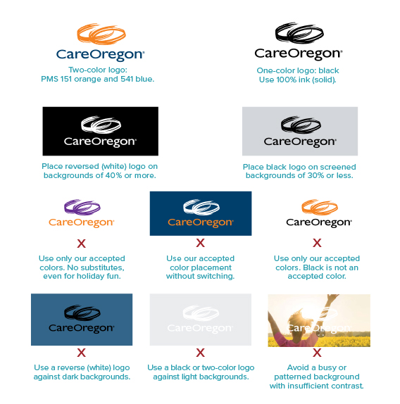
- Use only the accepted logo colors of PMS 151 orange and PMS 541 blue.
- When using the color logo, do not switch colors. The swirl is always orange, and the wordmark is always blue.
- Always place the logo against a clean background. Never place the logo against a busy background.
- If you must place the logo against a photo or patterned background, adjust the background to provide sufficient contrast. The logo must stand out. Contrast must pass visual test at webaim.org/ resources/contrastchecker
- When using the reverse (white) logo, reverse the entire logo.
Logo Treatment
Incorrectlogo use
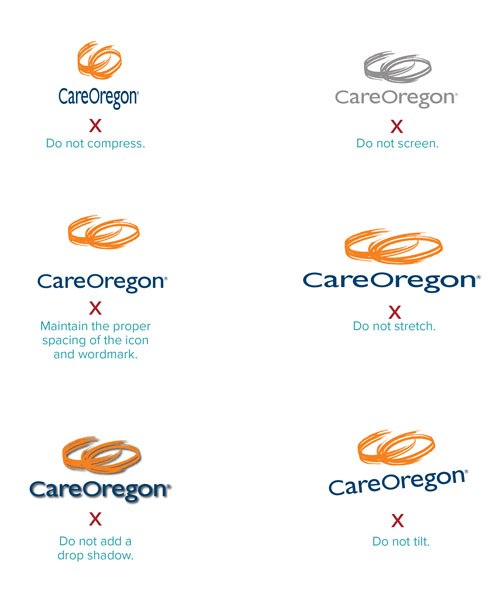
- Do not squish or stretch the logo. NOTE: Hold the shift key when enlarging or reducing the logo to keep the proportions correct.
- Do not screen the logo. Only use a solid 100% color.
- Keep the spacing of the swirl and the wordmark.
- Avoid drop shadows
- Do not tilt or alter the logo in any way.
- Use colors properly (see logo colors page).
Logo Treatment
Logo signatureand placement
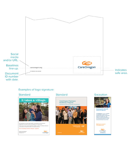
- The CareOregon signature consists of the logo and the URL.
- The URL lines up with the baseline of the logo wordmark.
- Place logo in bottom right corner.
- Exception: Center the logo when centering makes more sense with the design.
- Document ID: Each print piece is catalogued with a Document ID. Place it on the back at bottom left. Use 8-point Proxima Nova Light, capitalized, in this order:
- Line of business code
- ID number
- EN (language code)
- Revision date MMDD
Logo Treatment
CareOregonfamily of logos
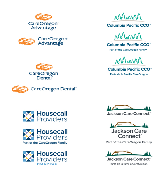
Columbia Pacific CCO and Jackson Care Connect
- Use the “Part of the CareOregon Family” tagline on all printed marketing materials.
- The tagline serves as a closing thought. So, if the logo appears multiple times on a piece, use the tagline on only the final logo.
- Do not use the tagline version on letterhead or other stationery items.
- Use the Spanish-language version logos on Spanish language materials.
- The Spanish-language tagline, like the English, serves as a closing thought. So, if the logo appears multiple times, use the tagline on only the final logo.
Logo Treatment
Family logoplacement
Placement of logos
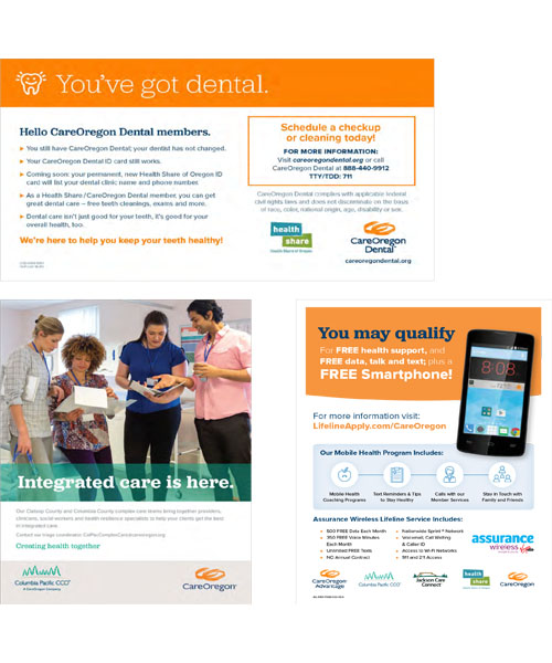
- In horizontal designs, the CareOregon logo is usually placed in the far right, lower corner.
- In vertical designs, the CareOregon logo is generally placed at the bottom.
- If the piece is co-branded with Health Share of Oregon, place the Health Share logo directly to the left of the CareOregon logo.
- If the piece is co-branded with a line of business from the CareOregon family, place that “family” logo in the far left, lower corner.
- When using multiple logos — including CareOregon, a logo from the CareOregon family or a partner logo — place the CareOregon logo to the far right.
Typography
Primarybrand fonts
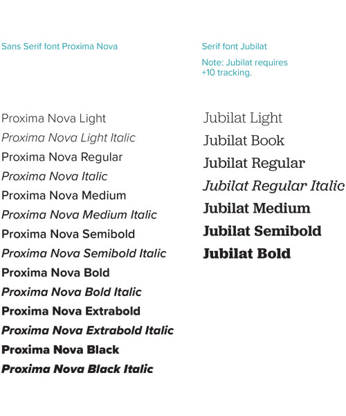
- Our primary brand fonts are Proxima Nova and Jubilat. Whenever possible, we use these fonts in all printed and digital communications.
- If Proxima Nova is not available, substitute Calibri.
Typography
Secondarybrand fonts
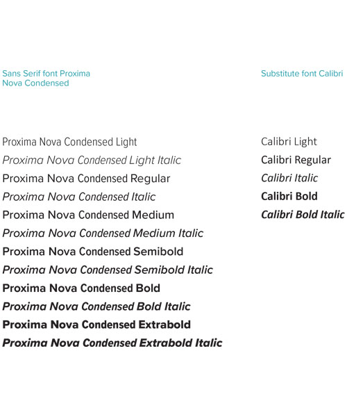
- We use condensed versions of our fonts when we need to fit a large amount of text into a small area.
- A common use for condensed fonts is in graphics and tables.
- Use Calibri as a substitute when our primary fonts are not available.
Typography
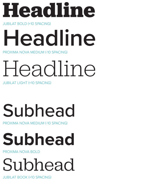
Applying fonts:heads/subheads
- Jubilat needs +10 kerning.
- Heads and subheads can be either Jubilat or Proxima Nova, depending on content and design.
Typography
Applying fonts:body copy
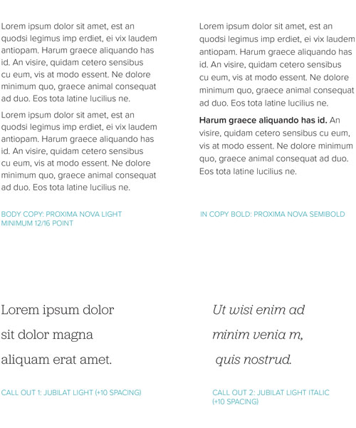
- Use Proxima Nova Light for body copy.
- Use heavier weights of Proxima Nova for emphasis.
- Use a minimum of 12-points on body copy
- Make leading at least 16-point on body copy.
- Large print is a minimum of 15-point body copy, and no less than 14-point for smaller text.
- Use italic sparingly.
Color
CareOregoncolor palette
- Use the primary colors for the majority of work.
- Use the secondary palette and tints for a wider range of expression.
- Use the Pantone® Color Matching System as a reference to ensure accuracy when matching colors for printed materials.
Color
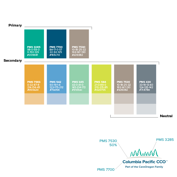
ColumbiaPacific CCOcolor palette
- Use the primary colors for the majority of work.
- Use the secondary palette and tints for a wider range of expression.
- Use the Pantone® Color Matching System as a reference to ensure accuracy when matching colors for printed materials.
Color
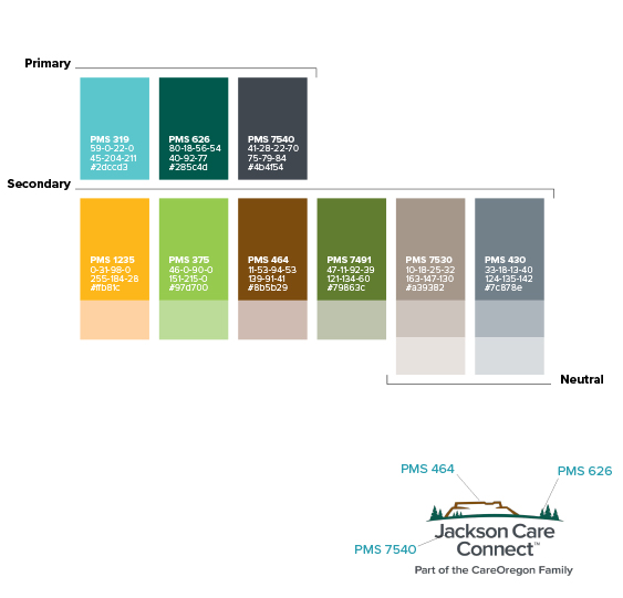
Jackson CareConnect colorpalette
- Use the primary colors for the majority of work.
- Use the secondary palette and tints for a wider range of expression.
- Use the Pantone® Color Matching System as a reference to ensure accuracy when matching colors for printed materials.
Color
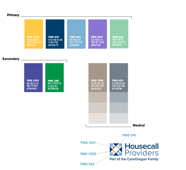
Housecall Providers color palette
- Use the primary colors for the majority of work.
- Use the secondary palette and tints for a wider range of expression.
- Use the Pantone® Color Matching System as a reference to ensure accuracy when matching colors for printed materials.
Brand Elements
Design Elements
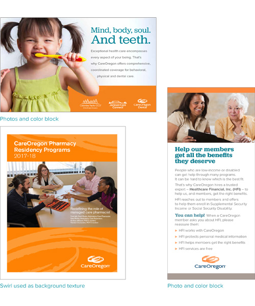
Overall, our design style is simple and clean, with plenty of white space.
- Use the CareOregon swirl (icon) to create texture.
- In addition to photographs, use color blocks to add dimension to the design. Be aware of contrast between background and overlaid text.
Photography
Photographyguidelines
We use both stock photos and custom photos shot by our staff or contract photographers. Whether selecting stock images or taking our own pictures, follow these guidelines:
- Select or take photos that are sharp and clear, unless blurriness is intentional.
- Use photos that represent our members, including ethnicity that reflects the populations of each line of business.
- Choose images that are aspirational and express achieving goals. We show health, happiness, vibrancy and interpersonal connections instead of pain, isolation, struggles and sadness.
- Avoid backgrounds or items that distract from the main subject, including non-CareOregon logos, backs turned toward the camera and trash cans.
